There are three levels where you can apply custom styles to your form without any CSS programming knowledge required.
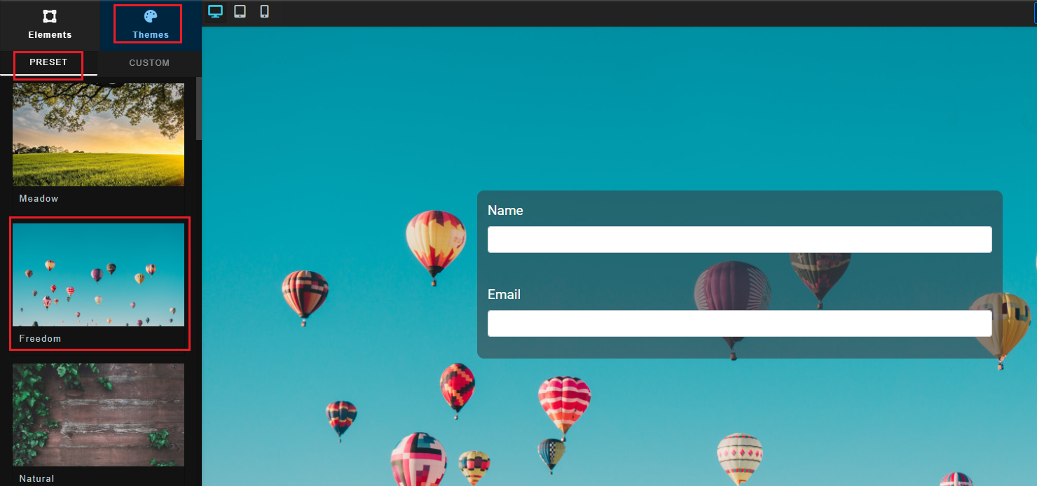
1. Pre-Set Themes
Pre-Set themes are an easy way to quickly assign base styles to your form. To use a pre-set theme simply click on the theme that most closely matches the final appearance you would like for your form. For example below we've clicked on the pre-set "Freedom" theme to apply it to the form:
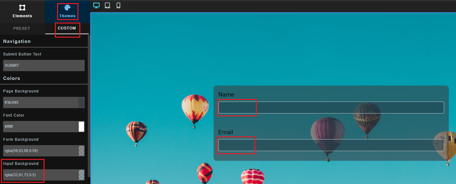
2. Theme Level Customizations
Once you have selected your pre-set theme, you can apply further "theme-level" styles by clicking on the "Custom" tab under the "Theme" tab. For example below we've chosen to set the background colour of inputs to a new colour that overrides the preset theme's default colour of white:
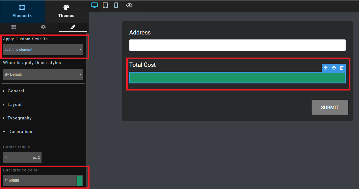
3. Component Level Style Customizations
You can apply styles at the component/field level by clicking on the item to select it, then in the left menu that appears, click on the paintbrush style icon, then choose "Just this element". For example below we have set a custom background color style on the "Total Cost" field on this form:
4. CSS/JS Code Level Style Customizations
You can also apply totally custom CSS/JS code customizations to the forms styles by including your own custom code into the form via Google Tag Manager.
Conditional Style Changes / Animations
For users who would like to make their forms even more unique, you can also choose to apply custom styles only on mouse "hover" of an element.
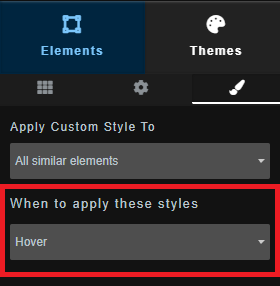
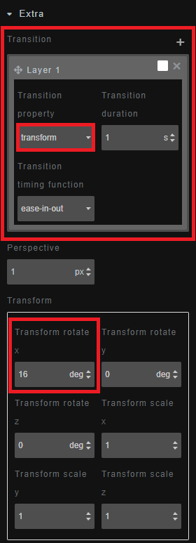
You can also enable "transitions" while defining your "Hover" styles to make smooth animated changes in style between what the default style is, and what the hover style is. For example making a "Card" element focusing more into view with a new background color, or tilting, or slightly increasing in size on hover. Below for instance we have said that on "Hover" we want an element to transform and rotate 16 degrees, over the course of 1 second.
Precedence of Styles
As you may have noticed from the examples above, where two styles override eachother, styles specified at a lower level always take precedence. For example if at the "Theme" level you have specified a field background color of "red", but at the individual component level have specified a background color of "green", then the individual component level style will take precendence and the background color for that particular component will become "green".
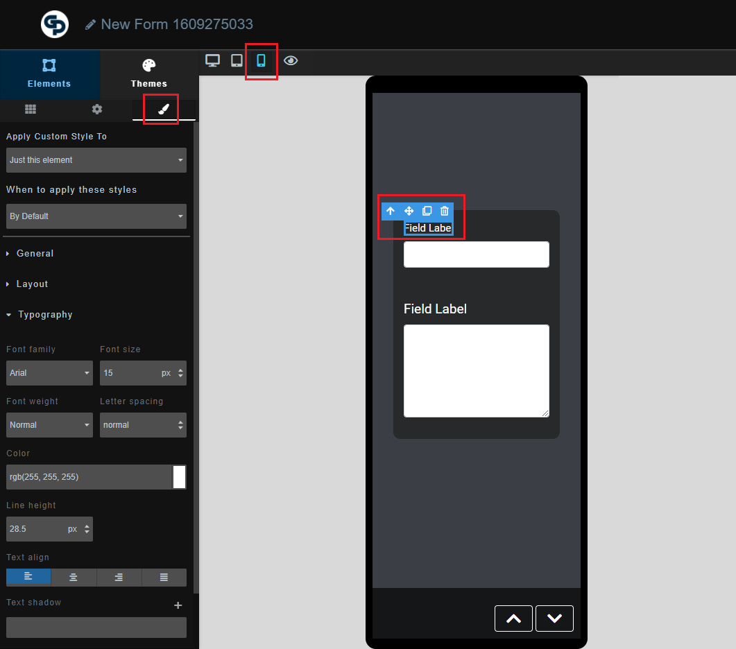
Style Tweaks For Mobile-Devices
In some scenarios you might also like to make tweaks to styles specifically for mobile devices. For example making a large header slightly smaller just for smaller devices, or hiding something completely on smaller devices. To apply "Mobile" specific styles simply click on the mobile icon, then apply individual component styles like you normally would. Any styles specified while viewing mobile preview will only apply on mobile sized screens. For example below we are making the font of a particular field smaller on mobile devices only: